A drink logo has a harder job than most. It has to read instantly on a crowded shelf, survive shrinking onto a can lid, and still feel like "your brand" across packaging, social and signage. With the non-alcoholic market heading toward about $2.55 trillion by 2030 and shelves more crowded than ever, a sharp logo is not decoration — it is how a new beverage earns a second look. This guide breaks the process into five practical steps.
Why we wrote this: We see a lot of beautiful drinks fail the shelf test because their logo was treated as the last 1% rather than a strategic decision. As a manufacturer, we live with the consequences — a logo that won't print cleanly on a can or scale to a label slows the whole launch. This guide shares what actually makes a beverage logo work in production, not just on screen.
Key Takeaways
- Strategy comes before style: define brand personality before touching colors or fonts.
- Simplicity wins on a shelf: a logo must stay legible when shrunk to a can lid or app icon.
- A logo is part of a system — color, typography and layout must work together, not in isolation.
Step 1-2: Strategy and Logo Type
Define personality first
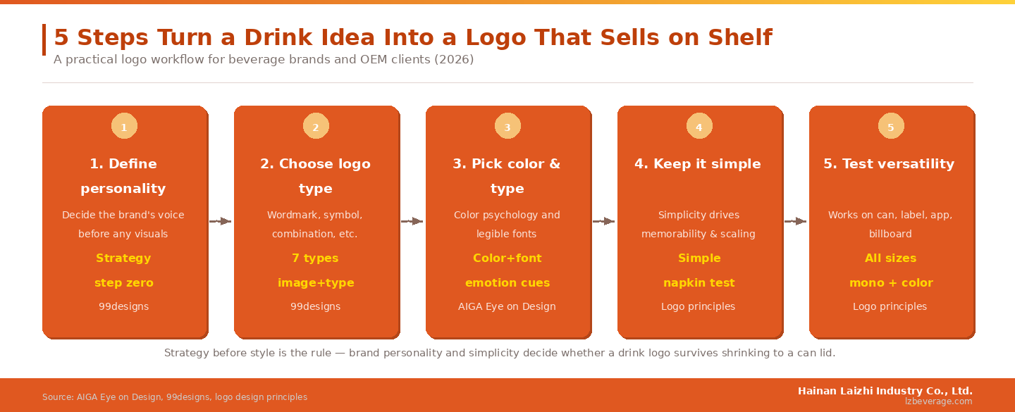
Before any visuals, decide who the brand is. A youthful, high-energy drink and a calm, natural wellness drink call for completely different design languages. As 99designs notes, every logo is a combination of image and typography, and there are seven distinct logo types — each giving a brand a different feel. Choosing the right type (wordmark, symbol, combination mark, and so on) is a strategic decision, not an aesthetic one.
Let typography carry meaning
In beverages, typography often does the heavy lifting. Professional design coverage shows how strong drink identities can be built almost entirely on type: AIGA's Eye on Design highlights brands using minimalist Nordic typography and "breathing space" between letters to convey freshness and calm. The lesson for a drink brand is that font choice communicates personality before a single color is added.
Putting the 99designs logo-type framework next to AIGA's typography examples makes the priority clear: a memorable drink logo starts as a strategy decision and is expressed through deliberate type and form — not a stock icon dropped onto a name. For a brand, that means the first hour should be spent defining personality and logo type, because every later choice (color, layout, packaging) inherits from it.
Step 3-5: Color, Simplicity and Versatility
With strategy set, the visual choices follow. Color and type should be chosen for their emotional signal — clean sans-serifs read as pure and modern, while warmer palettes feel natural and friendly. Simplicity is the decisive factor: design guidance consistently stresses that the best logos are simple, memorable, unique, versatile, relevant and timeless, and a useful gut-check is whether you could sketch it from memory. Finally, versatility matters more for drinks than almost any other product, because a logo must stay legible from a tiny app icon to a large display, in both color and monochrome.
For beverages specifically, the can or bottle is the real test surface. A logo that looks great on a screen but turns muddy when printed small or wrapped around a can will undercut the whole product. Designing with the final package in mind from step one avoids that trap.
Connecting the Logo to the Product
Design and production go together
The shelf is more competitive every year — RTD functional formats are leading the move toward a near-$250 billion functional market by 2030, which means more products fighting for the same glance. A strong logo helps, but it only pays off if it reproduces cleanly on the actual container. That is where design and manufacturing intersect: an experienced beverage manufacturing partner can advise on how artwork behaves on different can and bottle formats before you finalize it.
From logo to launch
Once the mark is locked, it has to live on a real product. Whether your concept is an energy drink or a juice, aligning the logo with the can format, label area and print method early keeps the visual identity intact from design file to finished pallet. You can review the product categories to see the formats your logo will need to work on.
Next-step checklist
- This week: write one sentence describing your brand's personality.
- This week: choose a logo type — wordmark, symbol, or combination.
- This month: test your draft logo at can-lid size and in black-and-white.
- This month: confirm with your OEM partner that the artwork prints cleanly on your container.
FAQ
What makes a good drink logo?
Simplicity, memorability and versatility. It should reflect the brand's personality, stay legible at small sizes, and work in both color and monochrome across packaging and digital.
Should a beverage logo use a symbol or just text?
Either can work. There are several logo types, and many strong drink brands rely on typography alone. The right choice depends on your brand personality and how the mark needs to scale.
Why does versatility matter so much for drinks?
Because a beverage logo must survive being shrunk onto a can lid or wrapped around a bottle while staying recognizable. Designing with the final package in mind — alongside your OEM partner — prevents costly reproduction problems.


